GoDaddy
Website Update
GoDaddy’s newly formed brand team was handed a simple charter: change the perception of the company in the marketplace to that of a trusted partner for everyday entrepreneurs—those brave souls who’d rather work 80 hours a week for themselves than 40 hours for someone else.
I led the UI/UX side of this transformation, using storytelling to determine how GoDaddy showed up in the digital space for millions of small business owners.
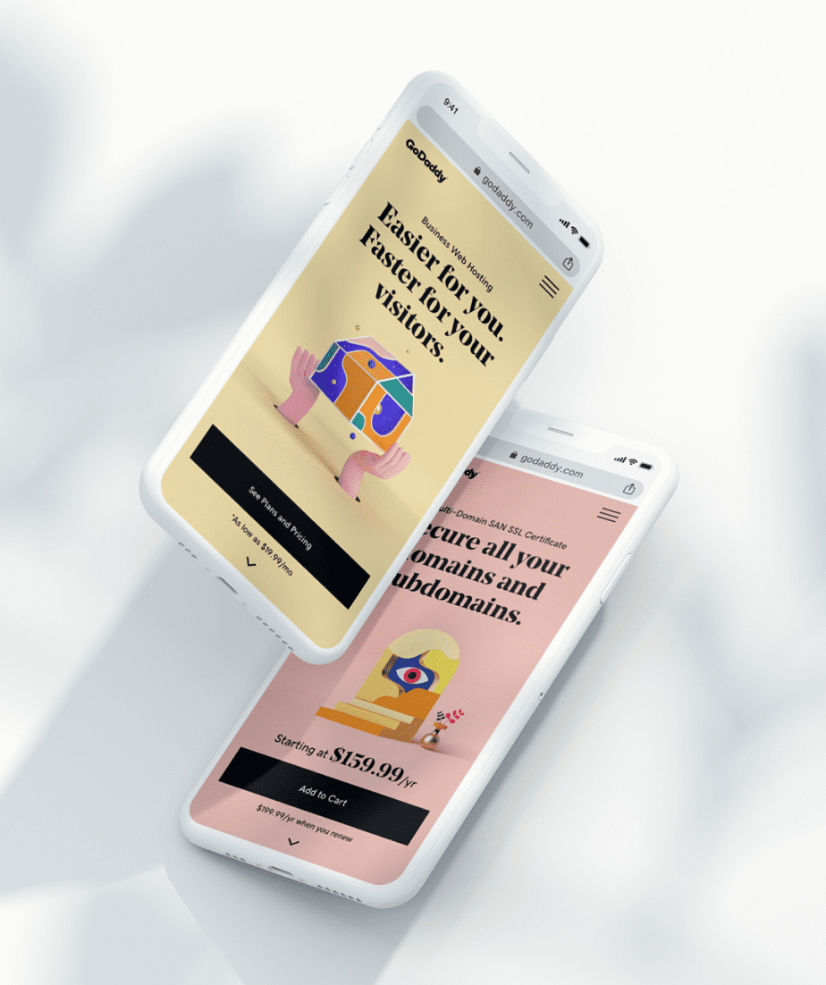
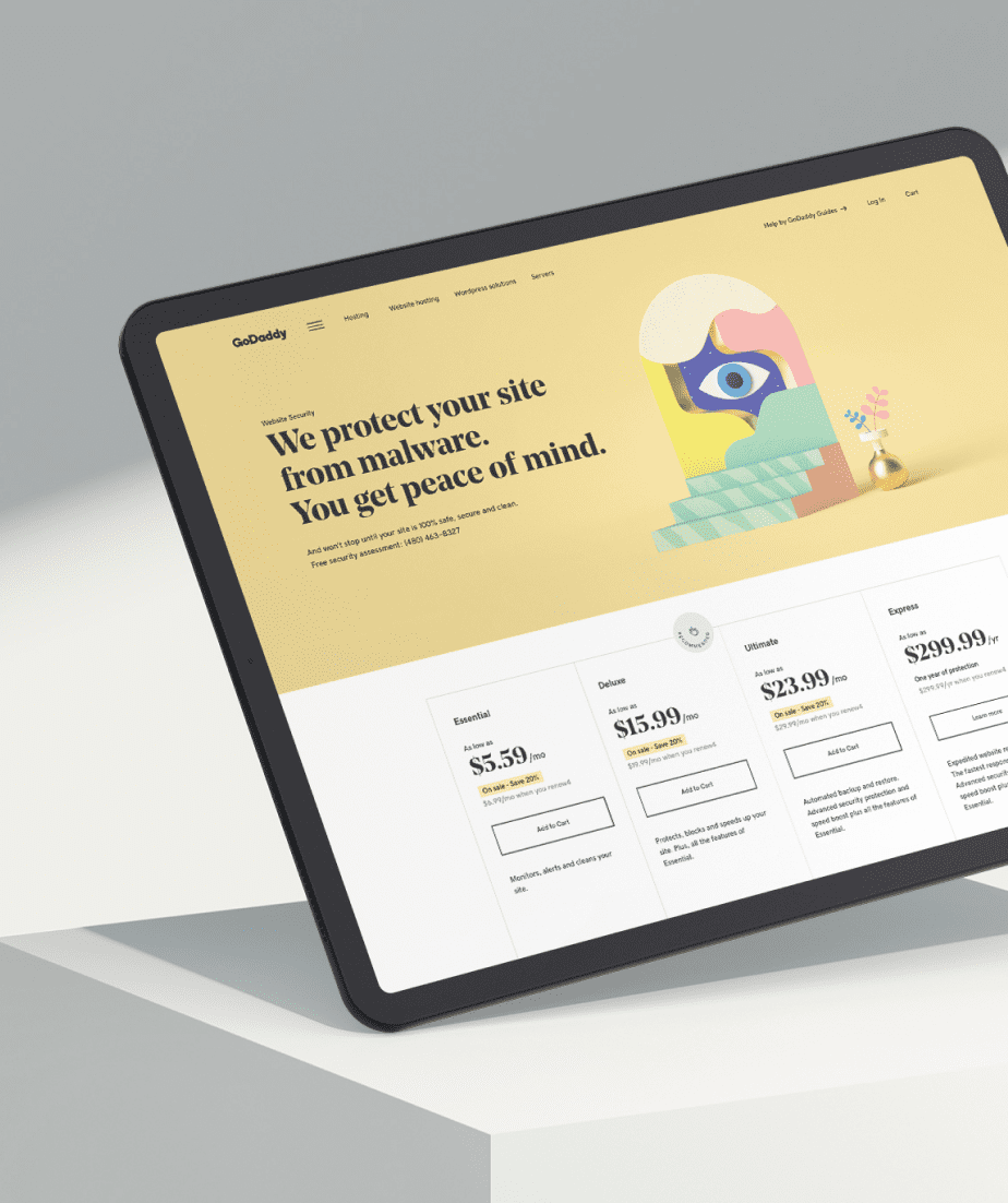
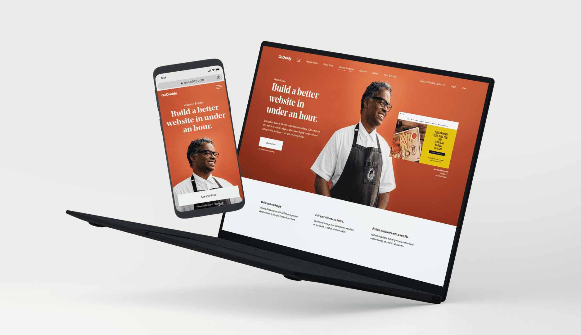
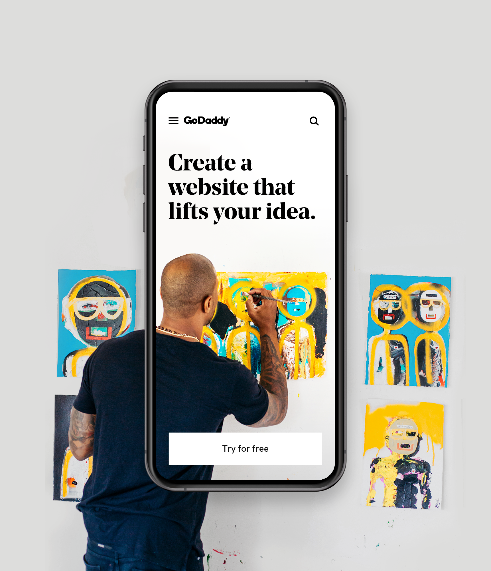
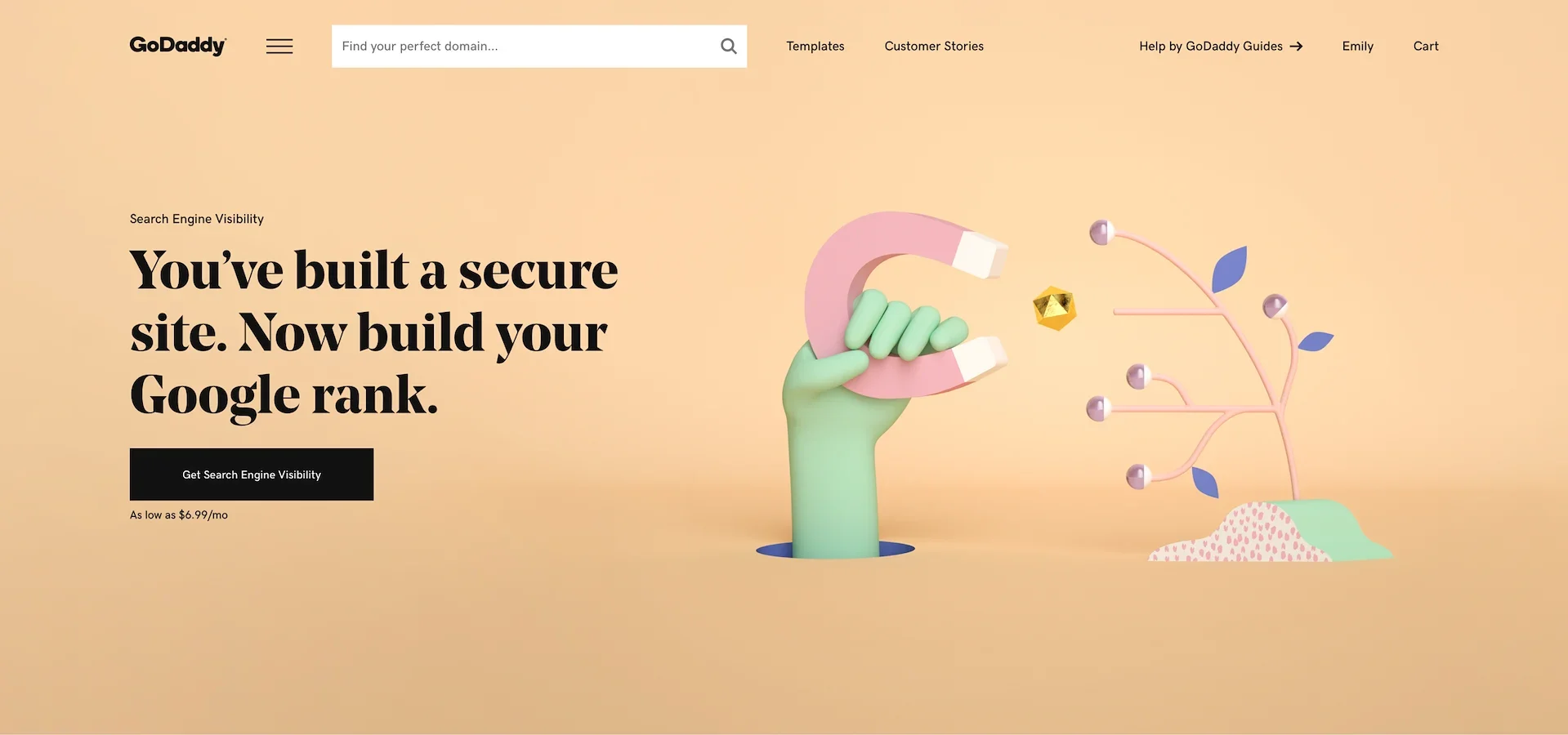
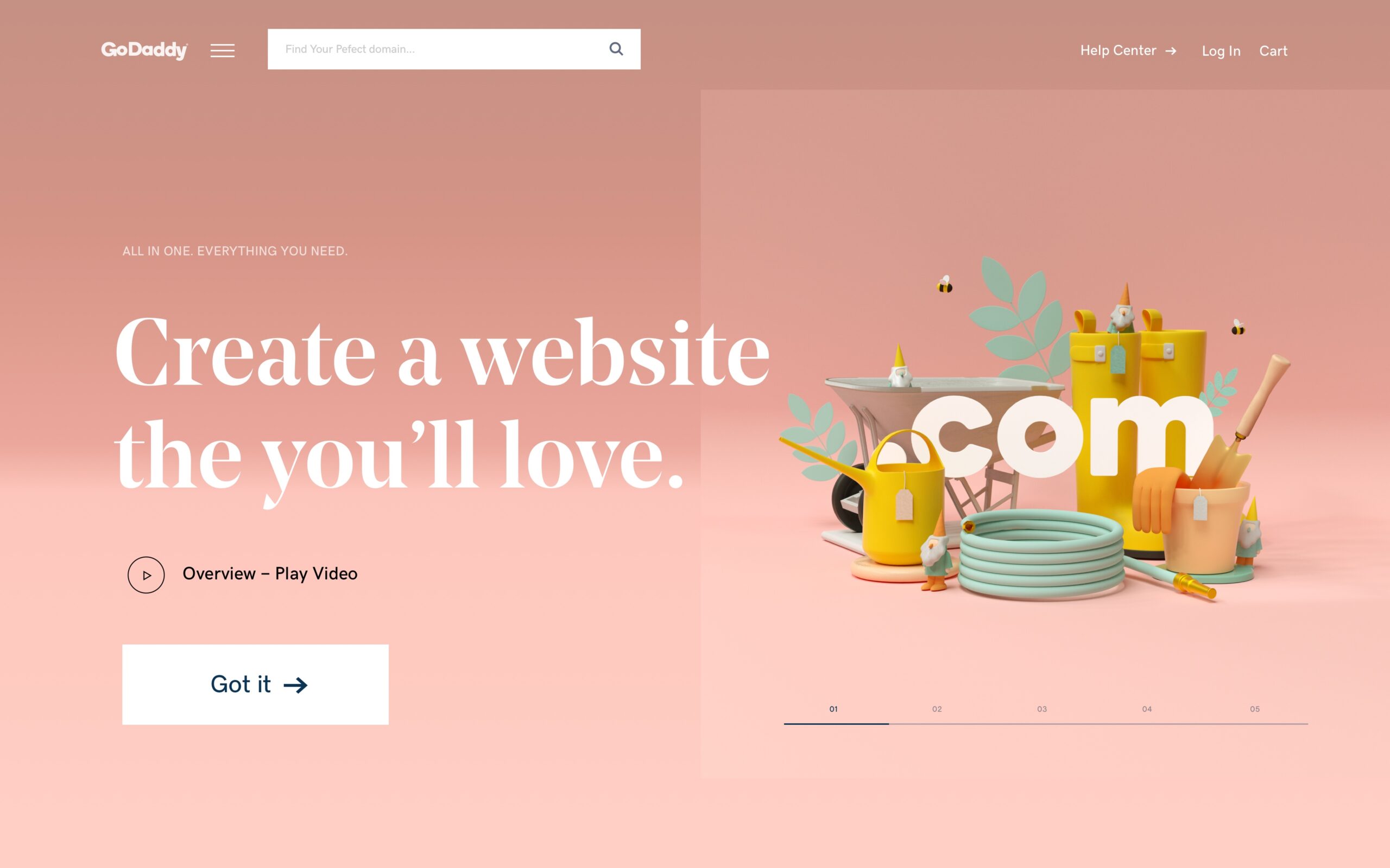
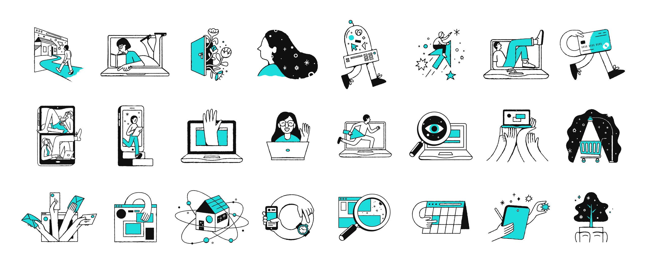
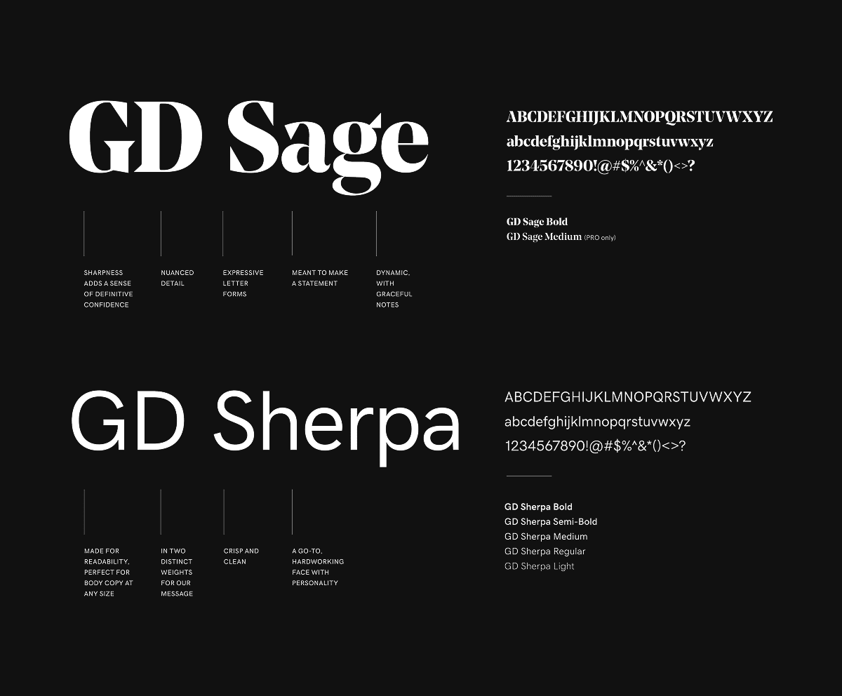
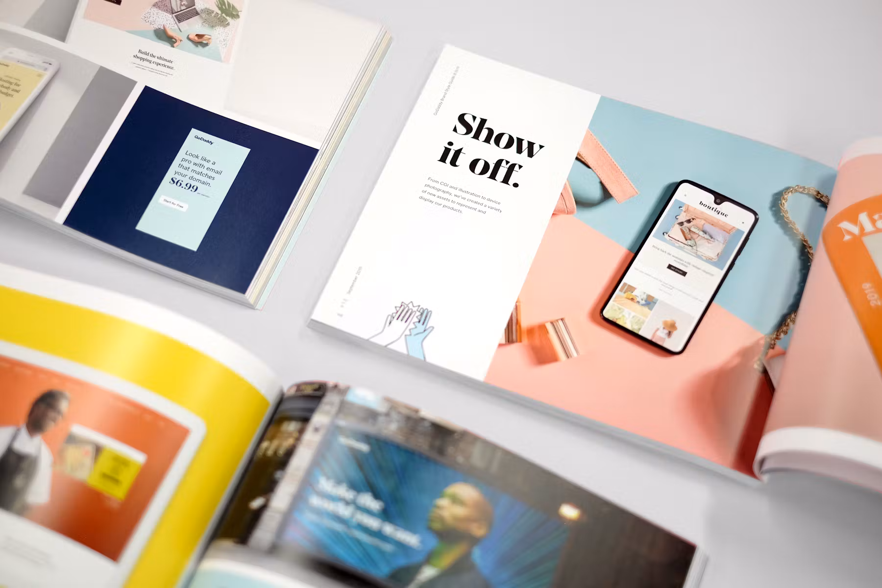
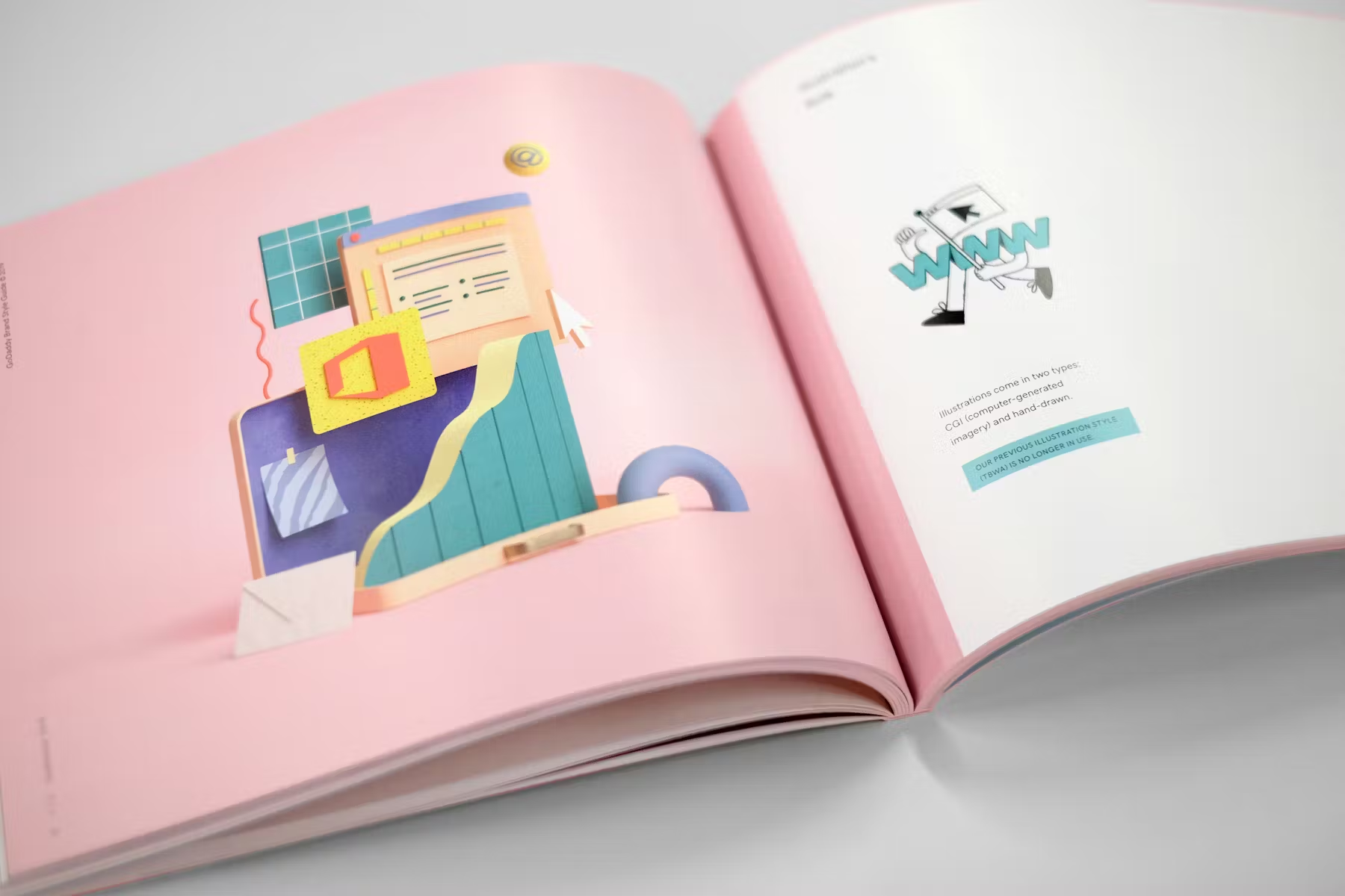
Joining forces with our talented brand team and a bevy of freelance artists, I took a bold new brand vision and made it come alive on our website. I utilized photography, CGI, and custom iconography to breathe life into the brand, guiding customers through narratives that illuminated and inspired. Pivotal elements of this work included introducing a new custom font and weaving a fresh accent color of teal to create a feel of modernity and distinction.
I rethought our entire merchandising strategy, eschewing product and services lists for a storytelling approach that introduced products at the appropriate phase of the user’s journey, from side hustle to growth to full-fledged business.
This effort laid the foundation for the strong work that came after, including a bold, modern logo update. The resulting platform brought clarity and cohesiveness that empowered and inspired entrepreneurs, providing them the confidence to take that next step in growing their business.
Goals &
Objectives
Our goal was to reimagine every facet of GoDaddy’s digital presence so entrepreneurs could find inspiration, clarity, and guidance worthy of a trusted partner. The experience needed to feel cohesive, modern, and bold—an environment that reflects the ambition of the people we serve.
I led the UI, UX, and motion direction of this transformation, creating a storytelling-driven experience that brought the brand to life through photography, CGI, custom iconography, and purposeful motion. Each element worked together to add emotional depth, narrative flow, and a sense of confidence to the journey.
Visual
Merchandising
A core part of this transformation was rethinking how we present GoDaddy’s digital products, making the invisible feel tangible, emotional, and easy to understand. Because most of our offerings live entirely online, the challenge was to express their value without relying on predictable imagery like someone using a laptop.
I led the effort to build a new visual system grounded in CGI, custom iconography, and motion, each crafted to capture the essence of what our tools enable, whether it’s building a site, managing a domain, or growing an online business. Partnering closely with Buck agency, along with freelance artists and our in-house production team, we created conceptual, stylized scenes that told a story at a glance and helped customers instantly understand how each product fits into their entrepreneurial journey.
These visuals became a cornerstone of GoDaddy’s storytelling toolkit, transforming abstract digital services into something aspirational, memorable, and beautifully human.
Font
& Colors
Typography was a pivotal aspect of GoDaddy’s rebrand. In moving away from GoDaddy’s former loud, brash voice and into one that exuded refinement and confidence, we needed a typeface to match. We went with a sharp, editorial-style serif for our headline typeface that signalled a more modern and mature GoDaddy had arrived. This typography change did more than refresh the look of our digital experience. It reshaped how the brand communicated to entrepreneurs. I worked closely with the brand and product teams to bring this new type system to the digital surfaces.
Another defining moment for the new brand was the introduction of GoDaddy Teal. Working with Koto and a small internal team, I defined and championed this new color. Teal strikes a balance between inspiration and trust, and the color gave GoDaddy an instantly recognizable presence in a crowded marketplace. I led the color’s rollout across product UI, photography, storytelling, and motion to ensure cohesiveness. Teal was the thread that unified the new global identity, bringing vibrancy and distinction to every touchpoint.
Motion
Motion became a defining layer of GoDaddy’s design language, adding clarity and emotion to the way users experience the brand. My goal was to make motion functional, not decorative, using it as a storytelling tool that guides users, establishes hierarchy, and brings digital interactions to life.
Every transition, fade, and micro-interaction was designed with clear intent, helping users understand what is happening, where to focus, and what to do next. Instead of using movement for spectacle, we built it around empathy and rhythm, allowing the interface to feel intuitive and alive.
This approach connected seamlessly with the new visual and typographic systems, turning GoDaddy’s interface into a living expression of the brand—confident, modern, and thoughtfully in motion
Design System Documentations
To unify all elements of the rebrand (typography, motion, and visual merchandising), I created a dedicated website that told the story of the transformation and served as a living resource for designers across the company. The goal was to make the rebrand more than a set of visual rules, turning it into a platform for creative evolution.
The site documented how the new color palette, type system, motion principles, and visual language work together to express a modern and human GoDaddy. It provided practical guidance, real examples, and downloadable assets to help designers apply the brand consistently while leaving room for exploration and innovation.
In essence, this documentation site became both a storytelling hub and a design framework, capturing the spirit of the rebrand while empowering teams to interpret, evolve, and expand it over time.
Impact
& Reflection
The rebrand marked a true turning point for GoDaddy, reshaping both how the company presented itself to the world and how it thought about design from within. What began as a visual transformation quickly grew into a cultural shift where design became central to product direction, storytelling, and customer experience.
The results spoke for themselves. The rebrand drove the first positive shift in brand interest scores since GoDaddy’s IPO in 2015, boosted traffic to GoDaddy.com by 20 percent, and increased brand search by 12 percent—well beyond the original 3 percent goal. Beyond the metrics, it also elevated inclusivity by highlighting real entrepreneur stories and showing a more diverse, authentic view of GoDaddy’s community around the world.
For me, the most rewarding outcome was seeing the renewed energy and confidence across the teams. Designers, engineers, and product managers began to think more holistically about how design could shape outcomes. Watching a once utilitarian brand evolve into something expressive, modern, and design-led was deeply fulfilling, and it sparked a wave of ambition across the company to keep building, refining, and pushing the experience even further.
Chief Brand Officer: Cameron Scott, Executive Brand Creative Director: Casey Sherstobitoff,
UI Designer: Zhenya Rynzhuk, Brand Creative Director: Chris Rushing, Brand Art Director: Nathen Cantwell, Brand Art Director: Jade Bayonet, Sr. Director of Brand Writing: Brian Dunn, Motion Graphics: Courtney Hannibal, Illustration: Buck, Chris DeLorenzo, Logo Design: Koto