GoDaddy
Logo
Update

Over twenty years ago, GoDaddy began by selling domain names—helping people bring their ideas to life online. But as entrepreneurship evolved, it was time for our brand to evolve too.

Working with a small internal task force and the creative team at Koto, I helped shape GoDaddy’s new visual identity—centered around a powerful new logo and mark known as the “GO.” Designed to capture the spirit of entrepreneurship, the mark symbolizes the joy, motion, and humanity behind people turning ideas into reality.

Once the logo was finalized, my focus shifted to the global rollout, transitioning every market and touchpoint to the new identity. While GoDaddy Teal had been introduced earlier, this rollout was the moment we went all in, officially making it our signature color. Every asset, from digital to physical, was unified under the new palette, giving GoDaddy an instantly recognizable and modern presence.

Beyond the visual change, this rollout represented a new mindset for GoDaddy—one that celebrated creativity, inclusion, and forward motion. It aligned every touchpoint with our mission to empower everyday entrepreneurs and marked the beginning of a more cohesive, human, and design-led brand experience.

Objectives

The goal of this project was to roll out GoDaddy’s new logo and visual identity across all global markets in a way that felt unified, intentional, and inspiring. Once the GO mark was finalized, our focus turned to building a cohesive system that brought clarity and consistency to every touchpoint — from digital products to marketing, retail, and environmental spaces.

This project was about more than updating assets; it was about establishing a clear visual language that tied the brand together across teams and regions. We refined the foundational elements — color, typography, photography, and motion — to ensure the new identity looked and felt cohesive everywhere it appeared.

My role was to ensure the rollout went beyond a visual change. It needed to serve as a catalyst for a broader design transformation — one that unified how GoDaddy showed up around the world and reflected our renewed commitment to empowering everyday entrepreneurs through thoughtful, expressive design.

Key
Contributions

As part of a small internal task force, I collaborated closely with Koto to help shape GoDaddy’s new visual identity and bring it to life across every touchpoint. My involvement went far beyond design execution. I played a key role in interpreting the strategic direction and translating it into tangible experiences that felt both globally consistent and locally adaptable.

Once the identity was finalized, I led the digital rollout of the new logo system, ensuring its integration across GoDaddy’s ecosystem. This included driving a complete overhaul of the website navigation, rethinking the user journey, and restructuring the information architecture to create a more intuitive, story-driven experience that guided users toward meaningful actions.

My contribution helped bridge the gap between brand and product, turning the new identity into something people could not only see but feel, a seamless expression of GoDaddy’s renewed mission to empower everyday entrepreneurs.

The Go
Meaning

The GO is more than a logo. It’s a symbol of what GoDaddy stands for and who it stands beside. Designed as a statement of advocacy for entrepreneurs everywhere, it embodies the courage to start, the persistence to keep going, and the optimism that defines the entrepreneurial journey.

The mark lives at the intersection of entrepreneurial spirit, joy, and humanity. Its sweeping arcs represent the indomitable drive of creators to bring their ideas to life, while its heart-shaped form reflects the love, optimism, and pride that fuel them along the way.

The continuous, overlapping stroke speaks to connection and inclusivity, a reminder that entrepreneurship is for everyone—no matter where they come from or what they’re building. The GO captures motion, energy, and confidence in a single, unified gesture, becoming not just a logo but a rallying cry to take the next step, to dream boldly, and to simply go.

All in
with the teal​

Goodbye green, hello teal. Originally introduced during GoDaddy’s rebrand, GoDaddy Teal became fully realized and embraced during the logo rollout — marking a bold, intentional shift in how the brand shows up for entrepreneurs.

Working closely with Koto and a small internal team, I helped define and champion this new hue — one crafted to represent growth, creativity, and forward momentum. Psychologically, teal strikes the perfect balance between inspiration and trust, encouraging entrepreneurs to express themselves while reinforcing GoDaddy’s role as a reliable digital partner.

Beyond its emotional resonance, teal gave GoDaddy a powerful visual advantage. It offered instant recognition, standing out in a crowded marketplace while bringing warmth and cohesion across every touchpoint. I helped lead its rollout globally — ensuring the color felt consistent and intentional across product UI, photography, storytelling, and motion — transforming it from a fresh accent into a unifying element of our global identity.

Showcasing
the New Era

To celebrate the launch of GoDaddy’s new logo, I built a dedicated site that told the story behind the mark and captured the company’s renewed energy. The experience showcased how the logo comes to life across digital and physical spaces through motion, photography, and storytelling, while connecting it back to the entrepreneurs it represents. More than a reveal, the site served as a storytelling platform that reflected GoDaddy’s evolution as both a brand and a business. By harnessing the excitement and media attention surrounding the launch, it helped attract creative talent and positioned GoDaddy as a modern, design-led company on the rise.

Impact
& Reflection

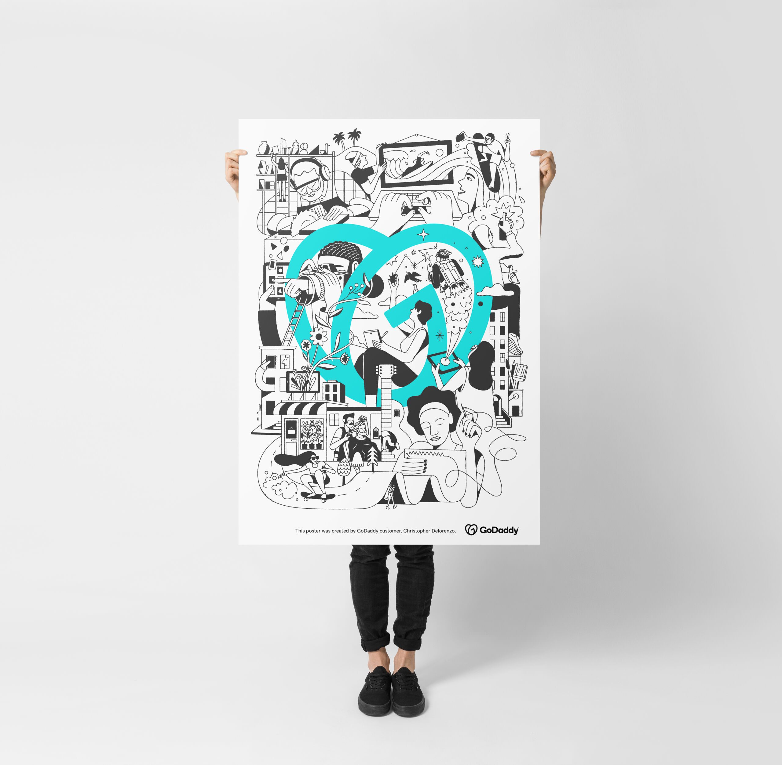
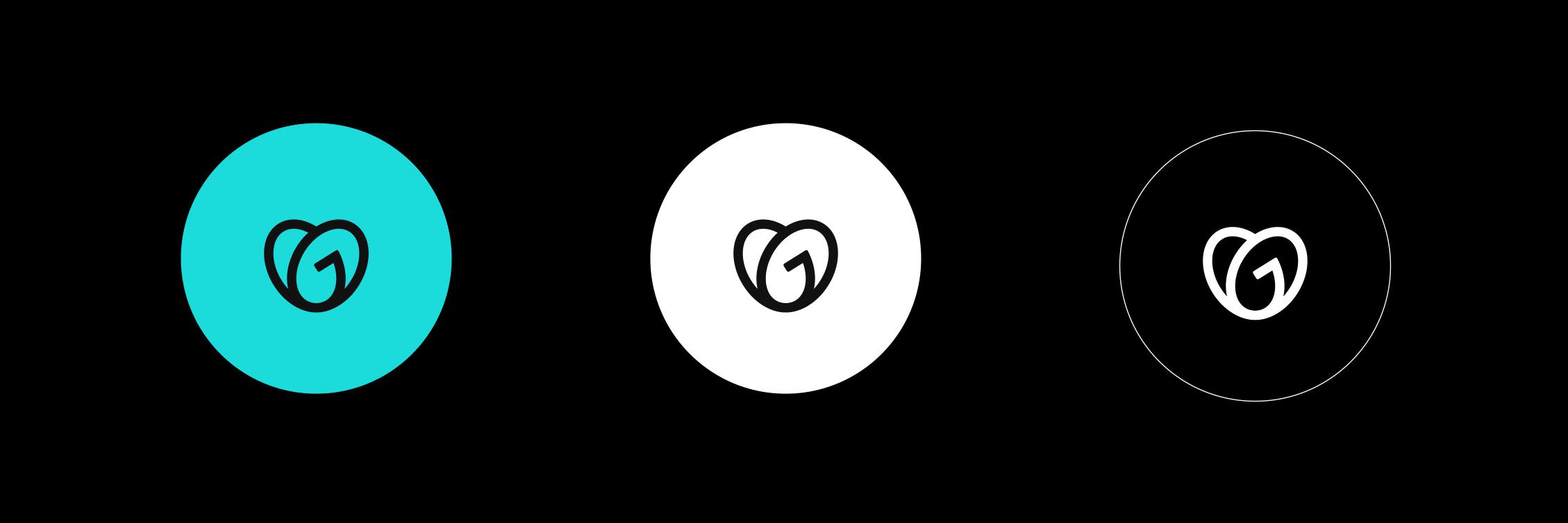
The GoDaddy Logo Rollout marked a powerful turning point for the company, both inside and out. Externally, the launch of the new identity—anchored by the GO mark and GoDaddy Teal—drove the first positive shift in brand interest scores since the company’s IPO in 2015. Traffic to GoDaddy.com increased by 20%, and brand search rose by 12%, far exceeding the original 3% goal.

More importantly, the refreshed identity transformed how people perceived GoDaddy: from a loud, transactional domain seller to a trusted, inspiring partner for entrepreneurs. It signaled maturity, empathy, and purpose, helping the brand connect more authentically with its audience.

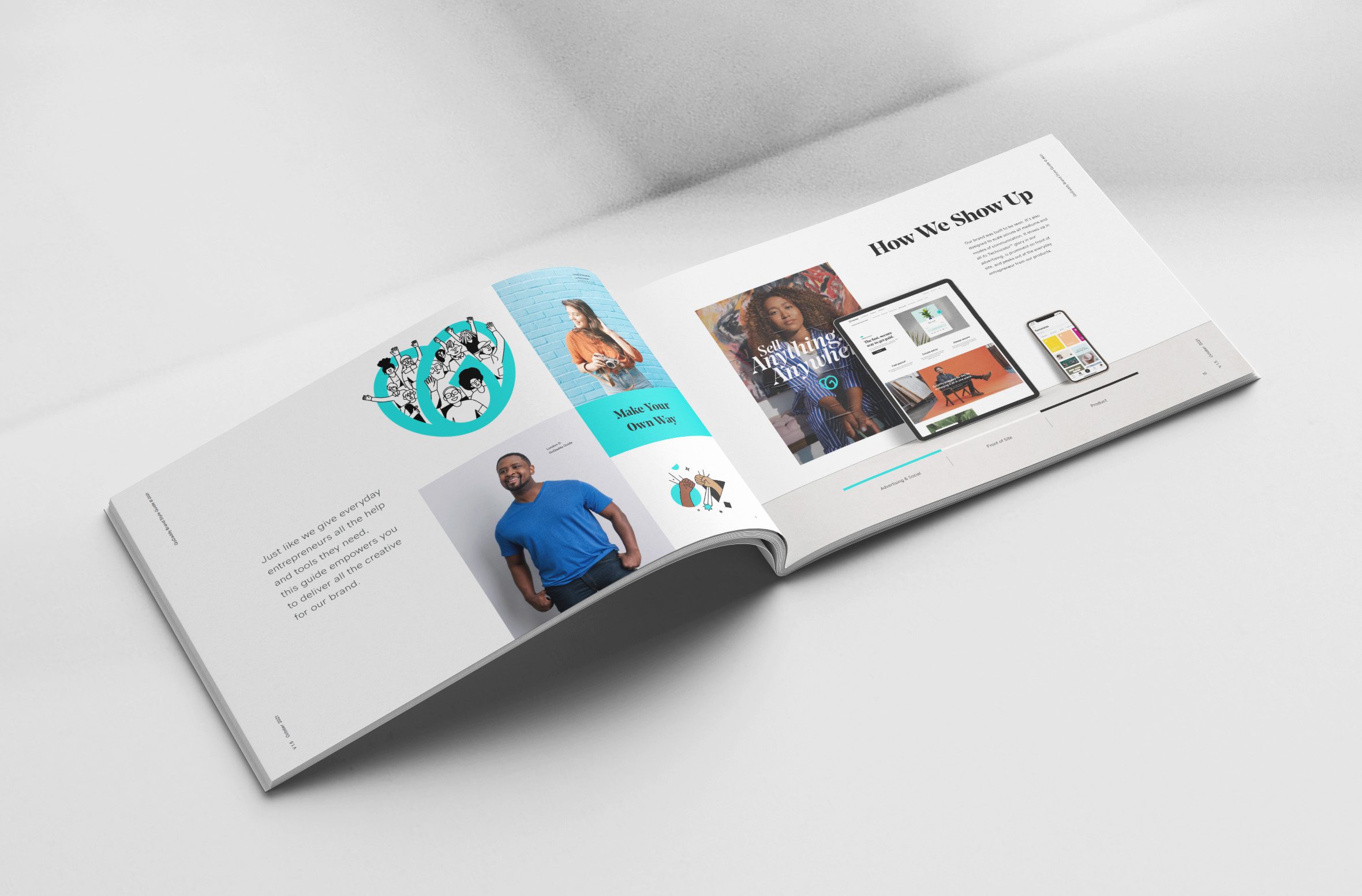
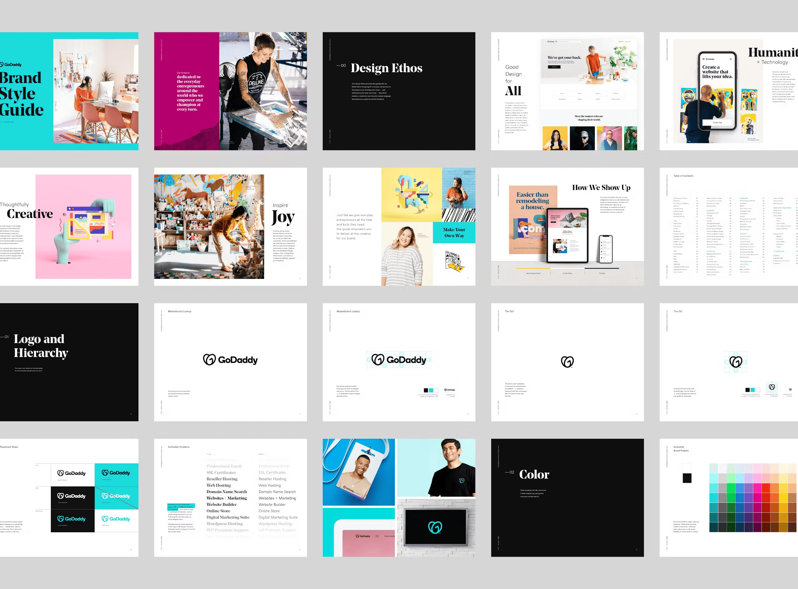
Internally, the rollout sparked a cultural shift. Designers, marketers, and product teams began speaking a shared visual language, using the new system as a foundation for creativity and cohesion. It brought a renewed sense of pride and ownership across the organization, reminding teams that design could lead transformation at scale.

For me, this project was deeply rewarding. It wasn’t just about changing how GoDaddy looked; it redefined how the company thought about design, storytelling, and its role in empowering millions of entrepreneurs to create boldly.

Chief Brand Officer: Cameron Scott, Executive Brand Creative Director: Casey Sherstobitoff,
UI Designer: Zhenya Rynzhuk, Brand Creative Director: Chris Rushing, Brand Art Director: Nathen Cantwell, Brand Art Director: Jade Bayonet, Sr. Director of Brand Writing: Brian Dunn, Motion Graphics: Courtney Hannibal, Illustration: Chris DeLorenzo, Logo Design: Koto